Customer Experience
Troubleshooting Slow Adoption to Your Kiosk Pilot
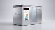
After you’ve invested time and money into planning your initial kiosk deployment, sluggish customer adoption can be a major frustration. But before scrapping your entire roll out, it’s worth examining whether the pilot conditions are set up for success.
May 28, 2025
 ChatGPT
 Grok
Grok Perplexity
 Claude
After you’ve invested time and money into planning your initial kiosk deployment, sluggish customer adoption can be a major frustration. But before scrapping your entire roll out, it’s worth examining whether the pilot conditions are set up for success.
Luckily, this early phase is the best time for adjustments. Course-correcting now helps ensure stronger kiosk adoption when the program scales.
Here, we cover common missteps that affect kiosk engagement and how to troubleshoot them.
Kiosk Placement
Where you place your kiosks directly affects how much engagement they get. Is the current location visible to patrons upon entry? Does it require effort to find them?
Before installation, observe foot traffic patterns to identify natural flow paths and common pause points. Areas where customers naturally stop can indicate where kiosks may be most successful.
In addition, A/B test different locations to determine which ones drive the most usage.
If your kiosks are out of sight or crowded into a high-traffic zone, consider reassessing their placement and testing for optimal placement.
UI and UX Performance
The user experience plays a critical role in kiosk adoption by influencing the amount of friction a customer encounters during the ordering process. Looking closely at the user interface (UI) and user experience (UX) data can identify bottlenecks.
In a 2022 survey by Raydiant, more than 25 percent of respondents indicated they avoid self-checkout because of a poor past experience. Because of this, it’s important to isolate and address problems quickly, before they turn customers away.
One area to track is the average order time at the kiosk versus with a cashier. If kiosk order times are significantly longer, that could suggest a poorly designed user experience with too many steps, unclear options, or difficult navigation and customization features. Kiosks that feel slow undermine the promise of efficiency, sending people past the self-service options and straight to the counter.
Additionally, running data on where transactions are being canceled can also be helpful.
If a customer abandons the order early in the process, it could indicate confusing navigation, too many steps, or the customer is overwhelmed.
However, abandoning at the checkout stage might tell you there is surprise friction in loyalty prompts or upsell pushes, unclear payment options, or even price shock.
Navigation Simplicity
If you identified navigation as an issue during your UX evaluation, there are steps you can take to rectify different concerns.
First, is the interface design intuitive for customers? If not, many users feel intimidated or believe the process will be cumbersome. Make sure you use icon-first navigation to eliminate confusion. Aim for 80 percent icons and only 20 percent text when planning your interface.
Second, limit the number of steps needed from beginning to end. Employing too many stages in the ordering process compromises your ability to deliver a fast, seamless customer experience.
Third, ensure key actions are easy to find. Don’t make users search for the checkout, navigation buttons, or customization choices. Instead, place them in prominent areas and prioritize most-used actions or menu options.
Lastly, consider utilizing a progress bar to reassure customers about the estimated time remaining. Often, just knowing where they are in the process can reduce user uncertainty and prevent drop-off.
Continue readingfrom Frank Mayer Kiosks and Displays
Included In This Story
Frank Mayer and Associates
Custom Kiosk Design | Manufacturer
Frank Mayer Kiosks and Displays specializes in large-scale rollouts of custom digital kiosks for enterprise and growth-oriented brands. With a relentless focus on premium design, customization, and end-to-end service, we manufacture self-service customer engagement solutions that expand market reach, boost sales, and enhance brand equity.
Related Media
Subscribe
Get the latest news and resources from Kiosk Marketplace.